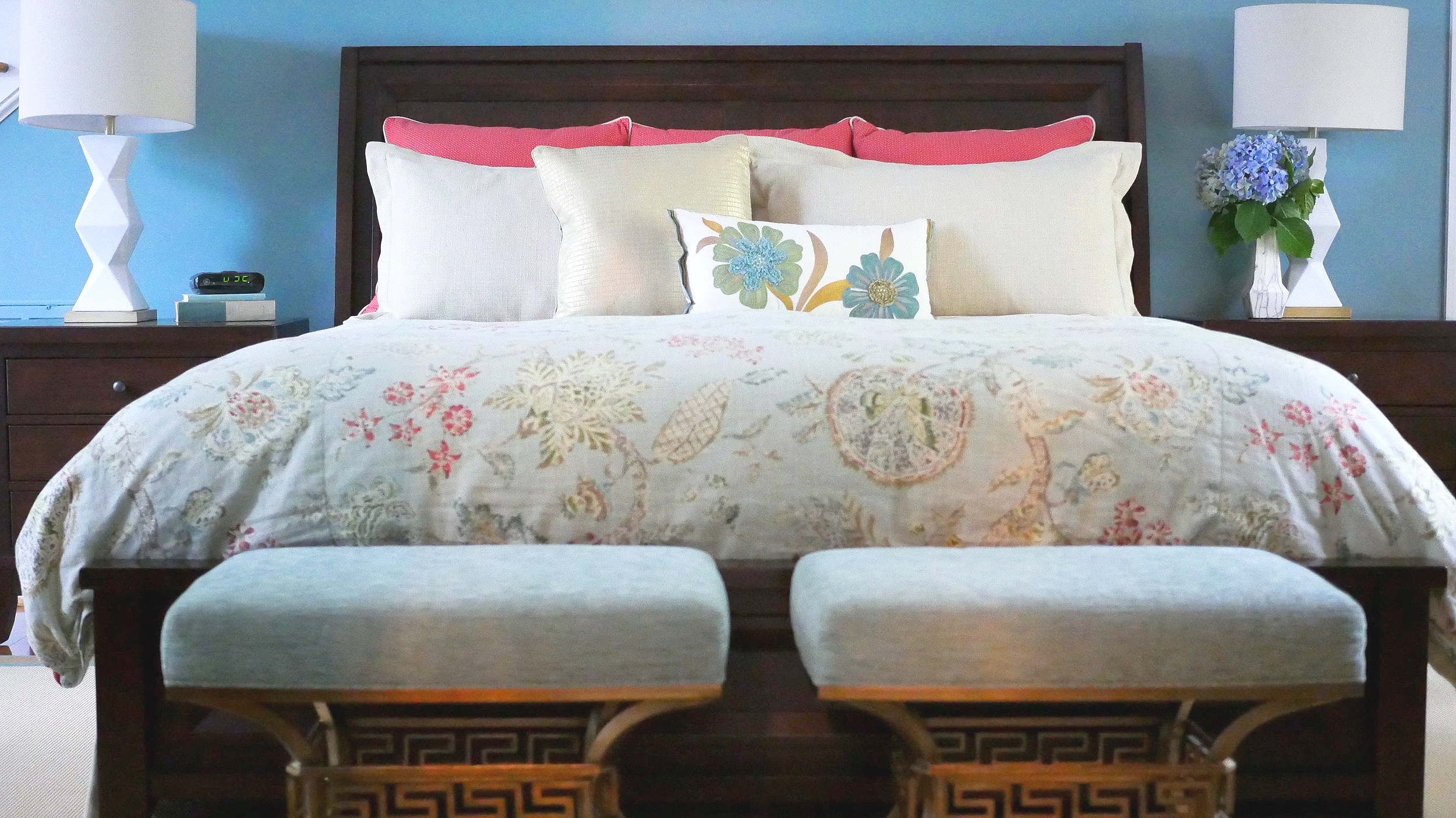
Let’s talk about paint! Just about every client along the way has asked me to share my standard, go-to paint colors. At that point, I take a deep breath & explain how I never ever do that.
I’ll tell ya why.
Every client is unique. Every person on this planet is unique. And for me, to draw a go-to color, a favorite color or a color I’ve used 20 times, and just say, “Here, run with this!” …. would be a disservice to that client. To randomly pull a color out of thin air before knowing a client’s personality, their furnishings, how comfortable they are with color and how they function in the space certainly doesn’t take any design skill & quite frankly, would seem lazy on my part.
There are millions of colors out there that we can pick from. In this day and age, we can match just about anything & turn it into a paint.
So, what is it that you have (inspiration piece?) or want to purchase for your home that’s most limiting? It could be a fabric (upholstery, pillows, window treatment) or the biggest limitation of all, a rug!
For example, let’s say you fall in love with a patterned fabric for a side chair and then decide you need a 9x12 area rug to compliment that fabric as well as your existing emerald green sofa. All the furnishings and soft goods in a room need to work together like a symphony. So I would rather know the overall palette of all those components before I ever limited myself to a paint color.
Also important is how contents of a room come across tonally. An example of this might be that you’ve got honey oak floors that you do not want to change. Well, those floors have warm, yellow & orange undertones, and you need to have a paint that is going to balance that out & not conflict. Think of that symphony again.
Your paint color… hue, value, intensity, light reflectiveness….all need to, collectively, make all the content of your room shine. Most often, I don’t try to make paint color steal the show. Don’t get me wrong, paint is critically important, but when paint is done correctly, it’s usually the “best supporting actor” allowing everything else in the space to be the star!
Sometimes I receive requests to do color consults by email with photos. I always respectfully decline because, truthfully, I need to stand in the space. I need to “feel” what’s there. That may seem a little hocus pocus-y, but there’s something to be said for the aura of the room & the way light filters through the windows at different times of the day…. because it definitely changes from home to home and how color is perceived. Color selection is super personal and must speak to the overall flavor of who you are, how comfortable you are with color, and work in harmony with everything else in your space.
Not gonna lie, picking out paint color is not always easy. Taking the time to paint some poster board samples & taping them up on the wall for a few days is ALWAYS a good idea if you’re even slightly unsure. Pay attention to how it looks at different times of the day. I assure you it will be time well spent & more cost effective in the long run.
To add one more thing to the mix… our eyes enable most of us to see about a million colors. But just like some people are color blind, some others can see many more dimensions & nuances of color than the average person. My Dad can wear a blue sock and black sock & never be the wiser. But both my daughter and I are hypersensitive to color and can pick up the slightest color undertones. Most of the time, that’s a blessing but other times, I may fret way too much! Lesson here is to consider asking a trusted source to give you additional feedback. Not your entire tribe, because we all know there can be too many cooks in the kitchen sometimes!!
Lastly, after you’ve nailed down your perfect paint color, now you’re headed to the paint store. You’ll then need to select the type/line of paint product as well as the sheen. Take advantage of the professionals in the paint store and let them guide you to the right product for your project. They have so much knowledge and experience, so don’t be afraid to ask questions.
I know you’ll do great with your fabulous color choices!!!
Beverly
“Color is a power which directly influences the soul”
Beverly Schoeneck, Principal Designer
180 Spaces, Interior Design


